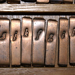
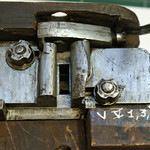
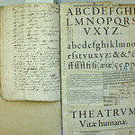
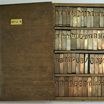
The stem division as the basis for the production of a gauge as shown in the first image below is a bit speculative. After all, it is an assumption based on measurements of type-foundry artifacts for which there seems to be no historical documentation to support it. However, in the case of the depicted Gros Canon Romain created by the talented Flemish punchcutter Hendrik van den Keere (ca.1540–1580) in 1573, the definition of a unit as one fourth of the stem thickness (image 2) results in 42 units from the upper ascender to the lower descender and is therefore equivalent to the division for the body that Joseph Moxon (1627–1691) mentions in Mechanick Exercises on the Whole Art of Printing (1683–84). The same is the case with Van den Keere’s La Plus Grande Romaine, type carved in boxwood from 1575 (the next two images).

Gauge distilled from /n of Gros Canon Romain
Moxon defines the body as ‘[…] is meant, in Letter-Cutters, Founders and Printers Language, the Side of the Space contained between the Top and Bottom Line of a Long Letter.’ An example of such a long letter, according to Moxon, is the capital /J. About ten years ago I cut and pasted the unitization in Moxon's engravings from Mechanick Exercises and placed the units on the stem interval of the lowercase (fifth image). I have not changed the distances between the letters in the engravings. Moxon uses a division of the body into ‘seven equal parts’ of six units each. Four such units seem to fit the lowercase stem width. The stem interval, i.e., the distance from stem to stem, seems perfectly supported by the unitization system. It is a logic I expect based on my measurements and distillations of type-foundry artifacts.

Gros Canon Romain /n with distilled units
Interestingly, body sizes in the past, such as Ascendonica, Vraie Parangonne and Gros Canon, included leading. Ultimately, the aperture of the mould defined the body size, and normally it was larger than the distance from the upper ascender to the lower descender. Therefore, a translation of these sizes into points, as presented for example at Wikipedia, is a bit tricky, because nowadays we use the point system to designate the body basically on the same way like Moxon’s top-to-bottom line of a ‘Long Letter’ definition. In this way one might get the impression that the relevant historical body sizes for text purposes contain a slightly larger type and thus larger x-heights than we are used to today. However, the translation to points on the aforementioned Wikipedia page is, of course, useful to show the mutual relationship between the different body sizes.

La Plus Grande Romaine /h with distilled units
One can imagine that for reasons of consistency and because of technical complexities in the Renaissance and Baroque, no translation into dimensions in thumbs, feet and phalanges was made by punchcutters and typefounders. On the other hand, however, one could argue that the use of these measurement systems could explain the local measurable differences in body sizes. That said, these can also be explained by a reproduction process related to copying existing letters. First of all, one must realize that it was not the punchcutter that ultimately determined the body size on which to cast the type, but the caster, or rather the mould selected for the job by the caster.

La Plus Grande Romaine /H with distilled units
The frameworks underlying the models of the archetypal punchcutters often show so many similarities that one might conclude that punchcutters were generally more type refiners than type designers, in essence copying each other’s work. The duplication approach makes perfect sense when one considers the limitations of the early font-production process: copying an established framework also copied intrinsic patterns, standardization, and even unitization. In this way, technical and artistic success was assured by applying frameworks that had been proven to work.

Moxon’s unitization superimposed on his engraving
Foundry type could be copied by making smoke proofs and transferring them to a blank piece of steel (note that foundry type basically contains identical copies of the images on the associated punches). By distilling the unitization from the stems of the source model, as described above, the intrinsic unitization was also copied. However, one could argue that the accuracy of the copied image affects the size of the unitization. For example, a lighter image makes the units (four per stem width) smaller, and a bolder image makes the units larger. This, of course, affects all characters.
When copying a framework to take advantage of its structure, one may want to do so as precisely as possible. Fluctuating unit widths are not very helpful. However, if one standardizes the width of a key character, say /n, and its relationship to units, then the original size of the units in the source model can be recreated. The width of the /n can be determined from the counter of the letter. If one places half the width of the counter from the left side of the left stem, the left side bearing is defined. One can do exactly the same on the right side. The total character width will always be the same, regardless of whether the image of the letter is light or bold. In the case of a light image, the counter will be wider and in the case of a bold image, it will be slightly smaller. So far, measurements seem to point to 29 units for the /n, as can be seen in the image below.

The total width of the /n of Van den Keere’s Reale Romaine divided into 29 units
Moreover, the mould itself could be the result of a copying process: existing foundry type cast on a certain body size could be used to define a new mould for the same body size. However, for the moment this is speculation. Translating to thumbs, feet, or whatever seems pointless here to say the least. That said, such a copying system can inevitably lead to minor deviations. After all, the source model could, for example, have been cast in a mould that allowed certain tolerances, because it had become somewhat unreliable over time due to intensive use. Copying could then be seen as standardizing errors.
The measuring systems outside the type foundries may have been superfluous in this case, because there was an intrinsic way of measuring that always worked, whether the type was bolder or lighter; variations caused, for example, by the transfer of soot images to pieces of steel for new punches. It could always be distilled in the same way, meaning that letterform images created an intrinsic unitization –of which they in turn were the result– that could be used for reproduction and modifications. In other words; with every image of a letter always came a standardized measurement system that could be used for the production of a gauge.
In conclusion: today, instead of staring at calculations in points or millimeters, perhaps we could take units distilled from stem widths as a basis for calculating the relationship between the proportions of roman type over the centuries. Maybe this can also be used for italics since the French Renaissance (see also this video). After all, that could have been the way of measuring and standardizing that the punchcutters themselves used from the beginning. However, this theory requires further research.


