An online practical and theoretical study of type design and font technology taught by Dr. Frank E. Blokland and Dr. Jürgen Willrodt, both pioneers in their professional fields.
In addition, from time to time, renowned colleagues (including former students of Frank from The Hague and Antwerp) will be invited to contribute to the otf Course.
1. Description
2. Program
3. Approach
4. Seats and requirements
5. Teachers
6. Research sources
7. Organization and costs
8. Sessions summary
9. Enrollment
10. Info sessions
1. Description
During the online otf Course, delivered via Zoom, letter aficionados will delve deeper into what type design and font production actually entails, by evaluating and questioning how to approach the subject theoretically and practically, also from less common points of view. This is done by exploring and analyzing the historical, aesthetic, and technical aspects of type design and typography. The aim is a deep understanding of what exactly this comprises and a quantifiable translation of this knowledge into practical applications. The latter is, of course, only possible by learning how to master the creative process and associated production software. That is why the emphasis during the course is also on these specific aspects of type design.
In short, the otf Course covers all the usual ingredients of type-design education, such as drawing, spacing, kerning, font formats, (automation of) font production, etc. However, on top of that, there is also a unique and advanced approach, based on almost 40 years of experience in type-design education combined with academic research.

Glyphs 3 showing dtl Haarlemmer on a cadence pattern
As for the historical context, research into Renaissance standardization and systematization can provide deeper insights into the intrinsic structure of consciously or unconsciously (think of conventions) reproduced archetypal frameworks. This can result, for example, in a more authentic interpretation of the respective source models when creating a revival. Moreover, the distilled patterns can be used to further master the harmonic and rhythmic aspects of type in today’s digital font-production environment. This includes the creation of new, contemporary type designs.
2. Program
The otf Course explores and questions the basis of traditional typographic conditioning. For example, the role of the eye –and what exactly is meant by it– is examined by a reconstruction of what underlies the student’s perception. In addition, the role of the pen in relation to type is reviewed. How big is that role exactly and what is the impact of factors such as contrast sorts, contrast flow, and contrast on type (design)? For example, is emphasizing the pen when creating letterforms the best approach, or is it simply useful to gain insight into the subject in order to be able to classify things, and mostly helpful in designing digital type in a kind of craft environment?
The course (re)builds type based on a thorough analysis of stripped-down archetypal structures and their underlying logic, as recorded in the LetterModeller application and the associated LeMo Method. Type design is approached from the idea that form and pattern are intrinsically linked, taking into account the organic standardization and systematization in the written source models and historical technical font-production constraints. Furthermore, thoroughly mapping patterns allows for their parametric re-creation. The production workflow can in principle also be considered as a pattern in itself. The question then is to what extent the (constraints of the) software one uses influences the way one works and even thinks. Consequently, mindsets and patterns are evaluated, also by taking into account contemporary technical developments.

On the Origin of Patterning in Movable Latin Type
Nowadays, it seems that font editors are putting the design process first. Font generation is then the last step, which is facilitated by tool developers by hiding the relatively complex technical issues. One could say that font production has become the last step in the digital type-design process. After all, the technical constraints seem quite limited and the emphasis is mainly on the design process. However, if one looks at the production methods of the past, one could argue that type design was the first step in the font-production process back then. In other words, the requirements and constraints of the font-production process defined the type-design process and not the other way around. These constraints have undoubtedly influenced typographic conventions. Therefore, it makes sense to delve deeper into the archetypal processes for producing type during the course, and see what we can learn from them.
In addition, it makes sense to explore digital font technology in greater depth and examine its development over the past half-century. After all, OpenType and variable fonts, for example, are the result of a progression that began in the 1970s with the creation of the ikarus format. This development eventually led to the PostScript and TrueType font formats, culminating in the OpenType derivatives. The otf Course will also delve deeply into the underlying mechanisms of current digital font formats, examining how they work under the hood.
3. Approach
In conclusion, the emphasis of the otf course is thus largely on investigating the intrinsic pattern-forming aspects in historical type, which are as much the source as the result of typographic conventions. Historical and contemporary font technology, and their intrinsic relationship, play an important role. Information about standardization and unitization in the Renaissance is distilled from artifacts such as punches, matrices, foundry type, and prints. The results are extrapolated and translated into a systematic approach to digital font production. This includes issues such as the parameterization of spacing and kerning and the automation of type-generation processes. After all, the better type production is organized, the easier the type-design process becomes.
As for the font editors applied and discussed, students can use the application of their choice, be it Glyphs, RoboFont, FontLab, FontForge, FoundryMaster, or any other editor. The same goes for the operating system: it can be macOS, Windows, or a Linux distro. After all, while the controls for the font editors may differ, the resulting contour descriptions in cubic and quadratic Bézier curves are technically essentially the same, and so are the generated font formats. The dtl font tools provided with the course are available for the operating systems listed above.

Editing a glyph contour in cubic Bézier format
The direct exchange of knowledge and experience between students is a fundamental aspect of the course. This exchange is stimulated by a type-revival project on which the students have to work together. In addition to participating in the revival project, each student must personally design a new typeface, whether from scratch or a revival. The results are assessed (almost weekly) by the students themselves under the supervision of the teachers in so-called ‘type crits’. The course concludes with the production of a digitally printed booklet (10 booklets per student are sponsored by the course) that provides an overview of these projects.
As a side note, there will be classical music in the form of short videos at the start of each session, used metaphorically. The eclectic use of historical typefaces whose origins date back over 500 years is part of today’s typographic convention. However, listening to music from that time is less common: one is not conditioned to this by default. How many of today’s typographers who use, for example, Adobe Jenson or Adobe Garamond will also find Renaissance music common? Moreover, if one is not aware of the historical origins of these digital typefaces, how does one actually look at Renaissance type? After all, if digital revivals form the basis of one’s perception, how does one know that modern interpretations reflect the essence of the originals? After all, the listener hears the music filtered through the ears of the interpreters, while the typographer looks at historical type through the eyes of the revivalist.
4. Seats and requirements
There is room for a maximum of 16 students: this number is based on experience with online sessions. The minimum number of students is four, otherwise a group project is not really possible.
Regarding the requirements, a substantial knowledge and/or digital drawing skills are considered a prerequisite. However, the course is organized in such a way that less substantively and technically skilled students can also make rapid progress. In addition, the different development levels ensure a pleasant and interesting exchange between conditioned and less conditioned students through the required direct interaction. After all, the more experienced students bring their expertise, while the less conditioned students look at the material with a fresh eye.
5. Teachers
The sessions will be presented by Dr. Jürgen Willrodt and Dr. Frank E. Blokland. Together they have more than 80 years of experience in the type industry.

Jürgen Willrodt and Frank E. Blokland
Jürgen (Hamburg, 1952) studied physics and mathematics and received a doctorate in theoretical particle physics in 1976. Jürgen joined urw Software & Type GmbH in 1983 as a software engineer. His first major development project was the porting of the ikarus font-production system from dec to Sun Unix. Since 1985, he has been the lead developer of the ikarus system and created interpolation, autotracing, and hinting algorithms, as well as special algorithms for Kanji separation. In 1995, Jürgen became managing director at urw++ Design & Development GmbH and responsible for font production and the development of font tools, including ikarus and dtl FontMaster. Today Jürgen is co-owner of jpFonts and also responsible for the development of the dtl font tools, such as dtl OTMaster.

Jürgen programming at Fujitsu, Japan in 1991
Frank (Leiden, 1959) is a type designer of dtl Documenta [Sans], dtl Haarlemmer [Sans] and dtl VandenKeere, among others. From 1986 to 1990 he was a teacher at the Graphic School Haarlem and since 1987 he has been a senior lecturer in type design at the Royal Academy of Art. (kabk). From 1995 to 2025, Frank was senior lecturer and Research Fellow at the Plantin Institute of Typography in Antwerp. Frank founded the iconic Dutch Type Library in 1990 and a few years later he initiated and supervised the ongoing development of the dtl tools for professional font production. In October 2016, he successfully defended his PhD dissertation at Leiden University, which was the result of a study conducted to test the hypothesis that the German inventor of movable Latin type Johannes Gutenberg (ca.1400–1468) and his peers developed a highly standardized system for the production of textura type and that this system was adapted for the production of roman type in Renaissance Italy. A more extensive biography of Frank can be found here.

Frank in the former dtl Studio in 2000
6. Research sources
An important role is reserved for Frank’s dissertation. In On the Origin of Patterning in Movable Latin Type: Renaissance Standardisation, Systematisation, and Unitisation of Textura and Roman Type he argues that Renaissance typographic patterns were partly determined by requirements for the early font production. Hence, today’s typographic conventions are not only the result of optical preferences predating movable type, but at least as much the result of standardization that eased the Renaissance font production. A pdf of the dissertation can be downloaded for free from the Leiden University repository.
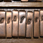
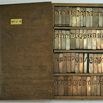
So far, the results of research by Frank and his students into the standardization and systematization of Renaisance and Baroque type have made it plausible that the archetypal punchcutters used established frameworks, defined in the early days of the profession, as a solid foundation for their ‘designs’. Basically, what they did was modifying these frameworks, which also originated in the intrinsic standardization of the underlying written model, by putting their idiom at the top. As such, in general the archetypal punchcutters could be considered more ‘type refiners’ than type designers. Above all, they produced a method of conveying information that was ergonomically appropriate for both the font producers and the end users, i.e., the punchcutters, matrix-justifiers, casters, typographers on the one hand, and the readers on the other.

Distillation of character widths in a print of Van den Keere’s/Garamont’s Moyen Canon Romain
Source material for research and the production of type revivals can, for example, be found on the web. Firstly, there is the British Library’s Incunabula Short Title Catalogue website to find 15th-century material. There are also links to ‘Electronic Facsimiles’. To search for publications from the 16th century, including from Plantin, one can consult the Bibliothèque nationale de France website. In both cases, it is possible to trace copies of found books in local libraries. A very important source for French Renaissance foundry-type artifacts is the online collection of Museum Plantin-Moretus in Antwerp. Blokland taught for 30 years under the roof of this illustrious museum and his Expert class Type design students thoroughly investigated the museum’s collection for their research into the standardization and unitization of the Renaissance font production.
7. Organization and costs
The 2025–2026 otf Course will be offered online via Zoom in the period from October to May. It consists of ten regular sessions on Tuesdays (the so-called ‘Type Tuesdays’) with three weeks in between, making a thorough home study possible. An additional eleventh session is reserved for the final evaluation and planning of the production of the booklet with the research results. The sessions will start at 10:30 cet and end at 17:00, including a lunch break (13:15–14:00 cet). The morning and afternoon sessions will each be interrupted by two coffee breaks of ten minutes. The ten sessions will take place on the following dates (subject to changes):
2025: 14 October, 4 November, 25 November, 16 December
2026: 6 January, 27 January, 17 February, 10 March, 31 March, 21 April, 12 May
The interaction between students and teachers outside of the Zoom sessions happens via a Slack, Flock, or Pumble workspace. This is where ideas and work are exchanged and source materials are posted. One will also find schedules, resources, and messages here.
The otf Course costs €995 (excl. vat –if applicable). For this amount, students receive eleven sessions, printed editions of Frank’s dissertation On the Origin of Patterning in Movable Latin Type, his Reflections on Type and Typography [Related Matters], and Dr. Peter Karow’s Digital Typography & Artificial Intelligence. In addition, students receive a perpetual license for dtl OTMaster, dtl FoundryMaster, dtl GPOSMaster, and dtl CompareMaster, with a commercial value of €815.
The group and personal projects will be collected in a booklet published by the otf Course preferably before the Christmas period following the graduation. In addition, after successfully completing the otf Course, graduates receive a certificate. Although the certificate has for now no formal status in the vocational educational field, it is a clear proof of competence and will undoubtedly be generally considered as such worldwide in the typographic profession.

Frank and Jürgen in the present dtl Studio in 2021
8. Sessions summary
Below one will find a summary of the sessions. In addition, the last two hours of each session are reserved for an in-depth explanation of font technology and how different font editors handle it, including aspects such as batch processing. The aforementioned dtl font tools that come with the course are also discussed in detail, including through practical sessions.
– 1. The value of research
Although not always considered necessary for digitally recreating historical types, research into Renaissance standardization and systematization can provide deeper insight into the intrinsic structure of (perhaps unconsciously) reproduced archetypal frameworks. Information hidden at first glance can support a more authentic interpretation of the source models in question, and the distilled patterns can be used to further master the harmonic and rhythmic aspects of letters in today’s digital font-production environment.
– 2. The quantifiability of type design and typography
What exactly is (the purpose of) type design, and who is one ultimately making type for? And how does one view the type-design process, and does one’s viewpoint influence one’s workflow? Moreover, are type and typography even objectively quantifiable?
– 3. Perception, calibration, and opinion
What exactly forms the basis of our perception of type and what do we exactly (want to) see? After all, one cannot see more than one knows. Yet, it is typically human to believe what one wants to believe and see what one wants to see. After all, it is rather tempting to mystify things, such as the eye of the type designer…
– 4. The dot on the i: constraints and design decisions
Standardization is an important aspect of the movable-type paradigm. After all, it all started with the intrinsic systematization in the handwritten source models. This formed the basis for the transfer of letterforms to a paradigm based on fixed-widths rectangles. This organization not only facilitated the entire process from punchcutting to casting type, but also supported consistency and reproducibility. In short: standardization is a prerequisite for design quality as well as the industrial strength of the final product.
– 5. Extended basics: knowledge-based design
What exactly defines a cursive and to what extent does a italic differ? And what about sloped romans? In addition, how do cursives/italics relate to a corresponding roman-type model: is it possible to design a cursive/italic on a pattern shared with the corresponding roman-type model?
– 6. The value of frameworks
After thoroughly examining and subsequent extraploating Renaissance frameworks in the context of the archetypal font-production constraints and considering the intrinsic patterns in the underlying handwritten models (think Lemo) the question is now to what extent this knowledge is valuable for understanding historical foundry type in general and punchcutter idioms in particular. Moreover, is this knowledge and insight useful for the current type-design practice, where the technical constraints seems to be rather limited?
– 7. Structuring and sharing mindsets
One could argue that one’s understanding of and related approach to type design and font production is at least in part the result of how one has been conditioned. For example, if one rely on one‘s eyes, what exactly is one relying on? On one’s teacher’s eye, for example? Is the basis for this way of perceiving objectively measurable, or are we constantly transmitting some kind of mythical truth to new generations of type designers? Incidentally, if such perception is quantifiable, is this then important from a practical point of view?
– 8. Industrial strength (in font production), part 1
It is tempting to look at type design and font production in general as an extrapolation of one’s own working method. The favorite font editor plays an important role here: once a workflow has been defined, it will undoubtedly become the reference point. However, the question is to what extent the tool itself determines the workflow and the associated mindset.
– 9. Industrial strength (in font production), part 2
Measuring is knowing and that is why a lot of time is rightly spent on fitting and measuring. As Lord Kelvin said: ‘If you cannot measure it, you cannot improve it.’ In the case of historic foundry type, the underlying framework can be distilled from prints or measured directly in the matrices, or even punches. This distilled patterning method is universal and the division into units is always based on the same principle. The question is what can we learn from this and how can we apply this knowledge to improve digital font production.
– 10. Recapitulation
The results of the research during the course into the standardization and systematization of Renaissance and Baroque type have or have not made it plausible that the archetypal punchcutters often used established frameworks, defined in the early days of the craft, as a solid foundation for their designs. Now is the time to evaluate the value of this research, especially in the context of the contemporary type-design practice.
– 11. Evaluation and booklet
The value of the research and the practical results are further evaluated. In addition, the design production of the booklet with an overview of these results is discussed.

Measuring the matrix of Van den Keere’s /g of the Moyen Canon Romain
9. Enrollment
Students can register via this form before September 14, 2025. After a thorough evaluation of this form, candidates will be contacted and further informed. Upon admission, one can pay the required amount by bank transfer, or by PayPal or credit card via a specially designated link. The course fee must be paid in full in advance and will not be refunded in whole or in part after the start of the course. If, however, due to unforeseen circumstances, one or more sessions are cancelled and cannot be rescheduled, an equal part of the amount will be refunded. For more information about the registration, contact the course organization at <otf@lettermodel.org>.
10. Info sessions
In the spring of 2025, two online sessions will be organized to further inform interested parties about the structure and content of the course. The exact dates will be announced soon.
Disclaimer: the otf Course organizers and instructors cannot be held liable for any irregularities, inconsistencies, or omissions of any kind in this course description, which should be considered ‘as is’.